Another Example of Lousy Design
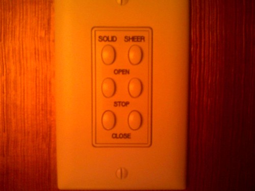
This curtain control is said to be an example of truly bad design. As the cutline says:
There is no natural mapping between the buttons and their functions. I went through quite a bit of trial & error before figuring it out. And the problem is that even once you figure it out, it's not very logical.But one commentator responded that
From the printing around the buttons,. it looks pretty clear... The right column is for the solid curtains and the left column for the sheer curtains. The top button in either column opens the curtains, the middle button stops them while opening or closing, and the bottom button closes them.This seems reasonable only after you've studied the panel for a while. In low light, in poor position, or if an old person is looking at it, the design is still bad, in my opinion. Most Americans, at least, tend to think of controls being arranged in vertical clusters, not columns. Maybe they could use some icons to improve effectiveness, or have two controls. Even better is to just use the old-style rods that you pull to open or close drapes. One big plus to the rod approach is that the visually impaired can figure it out, while the electric control doesn't even have a braille equivalent for its labels. Why overcomplicate things?
![]()

No comments:
Post a Comment